QT Hotels
One of Australia and New Zealand’s most loved hotel brands, QT offers exceptional and personalised guest experiences. With each of QT’s locations embracing the unique personality of that area, QT needed an overarching brand that both united and celebrated the individuality at the heart of their brand. We were tasked with creating a visual identity that matched the hotel experience — unexpected, unconventional and unrestricted.

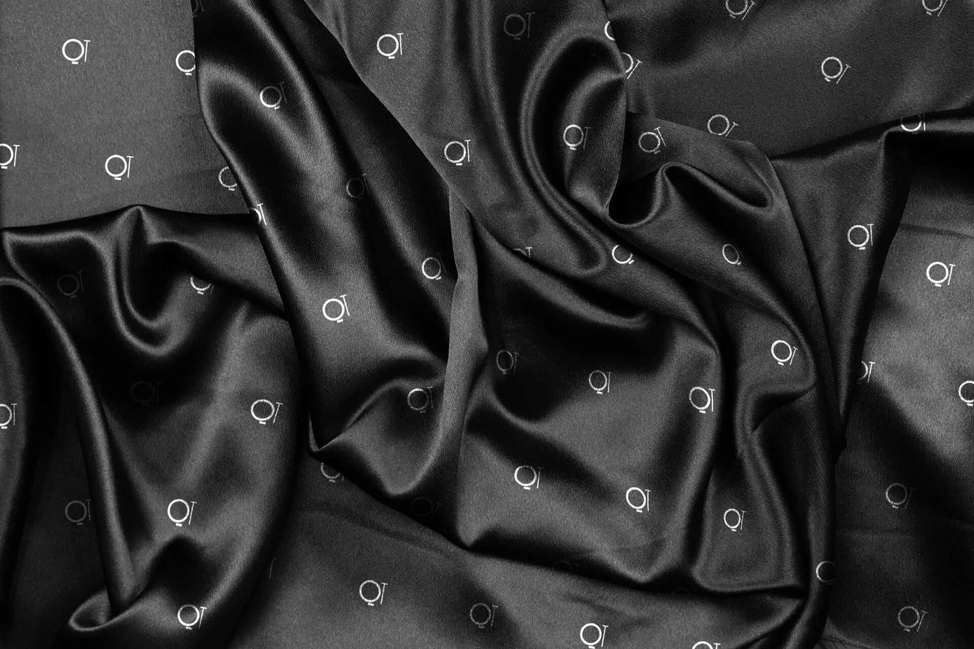
Solution
No two QT experiences are the same, and we wanted the same idea to translate into their visual identity — a brand with as much license to express itself as possible. With the unchanging assets of the QT logo and a black and white palette, all other elements of the brand are flexible. A variety of typographic styles and treatments, plus a suite of motion patterns all inspired by individual aspects of the hotels bring the wonderfully weird QT personality to life.
Studio: Landor Sydney