Sydney Opera House
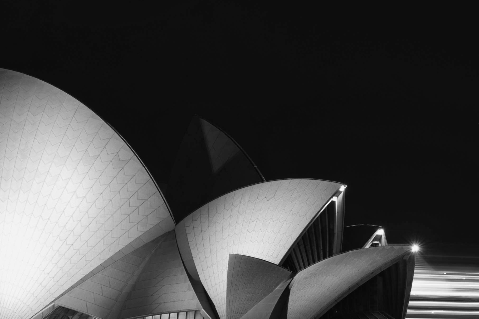
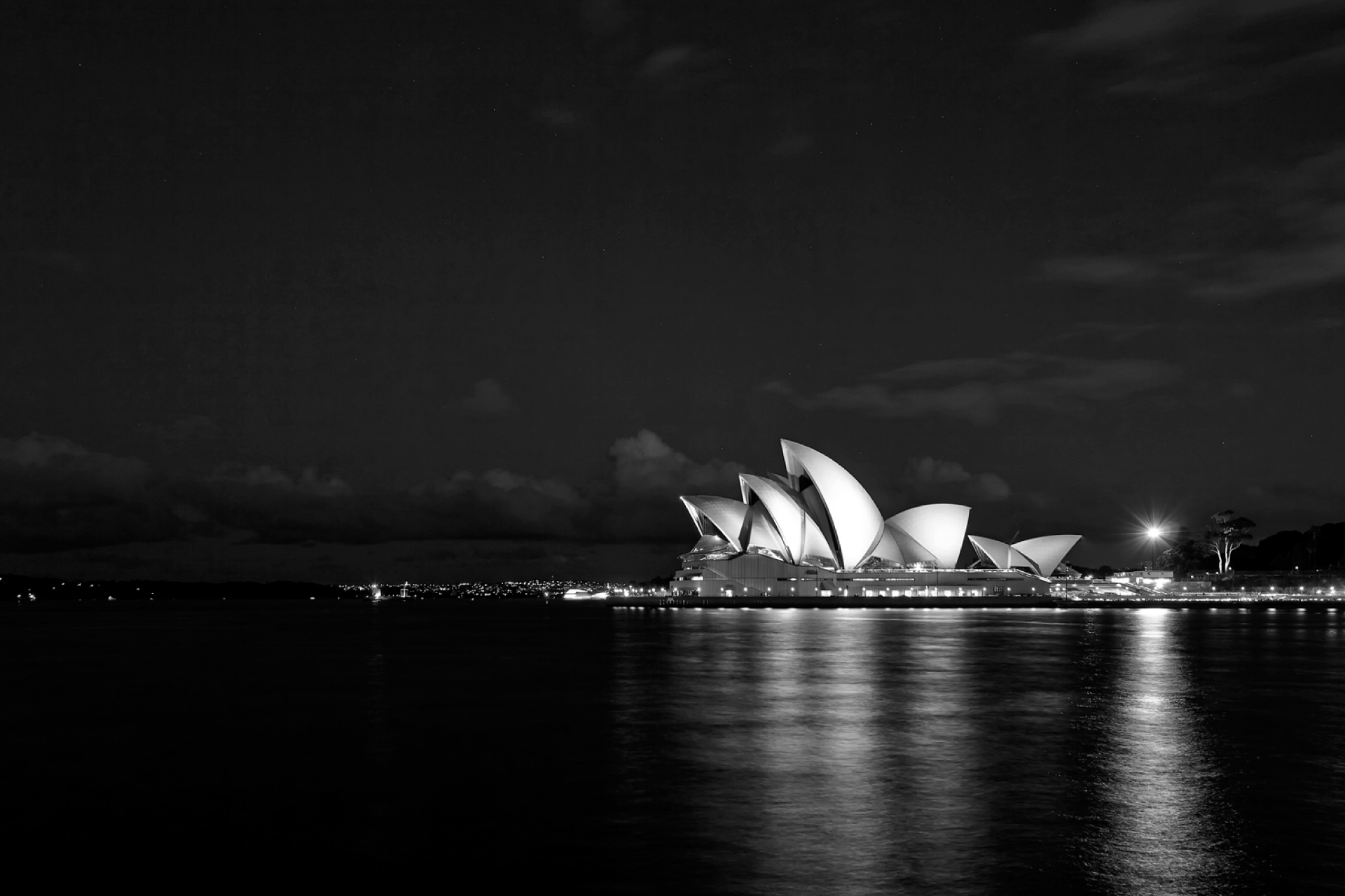
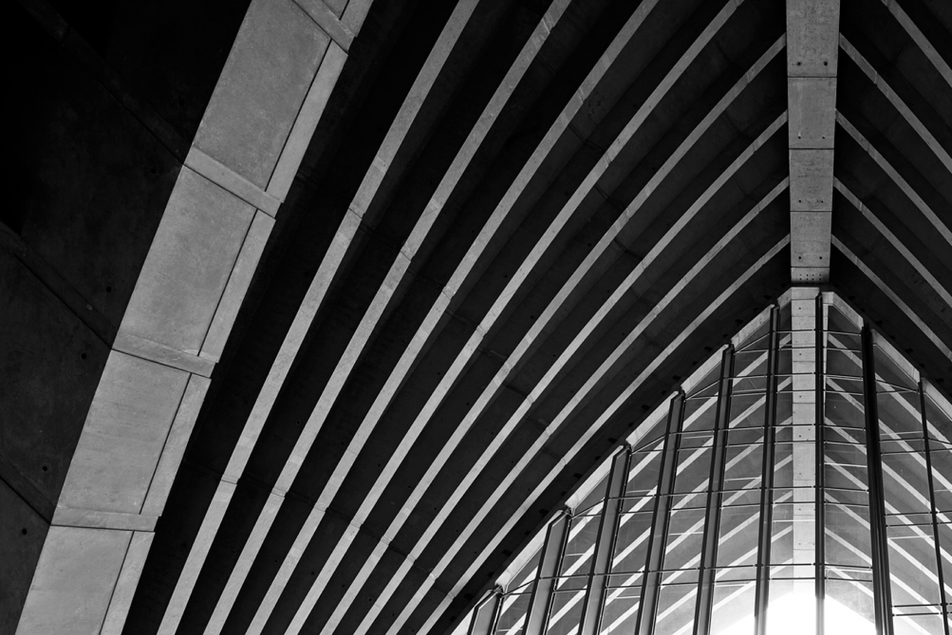
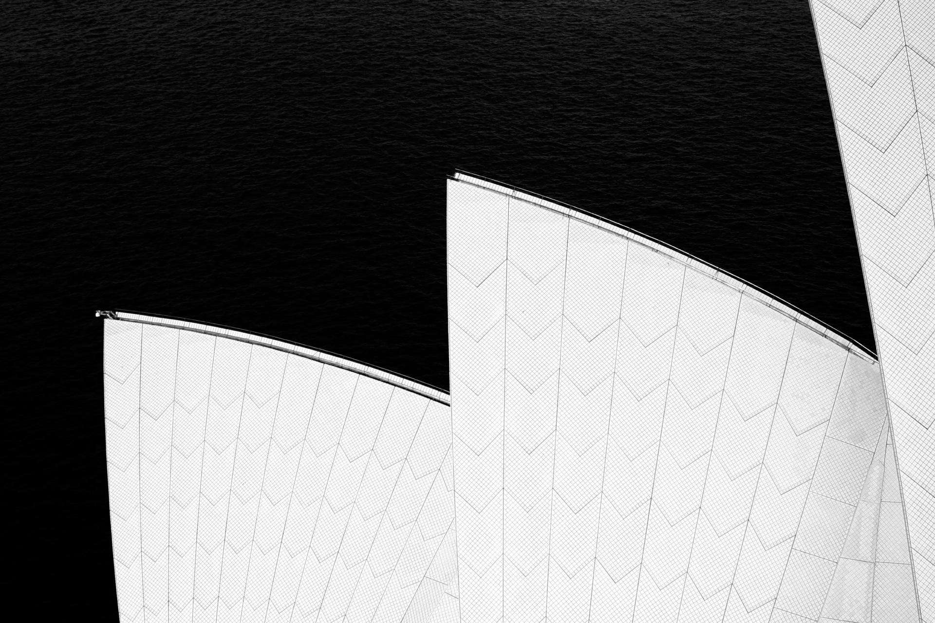
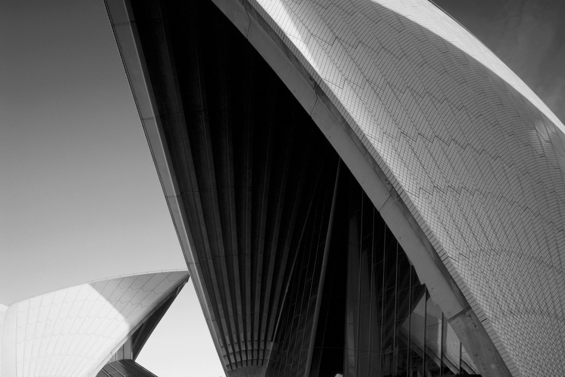
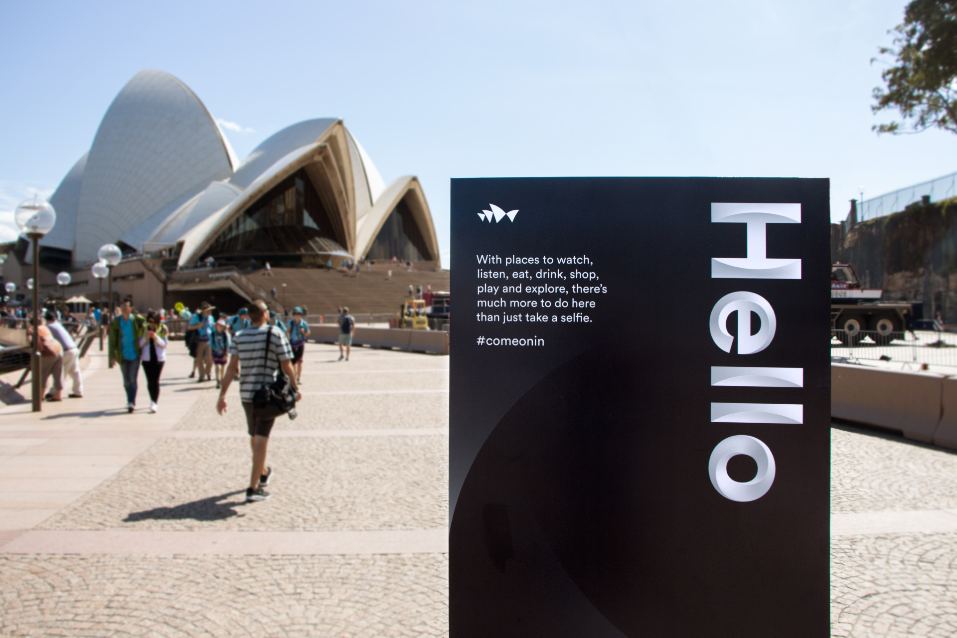
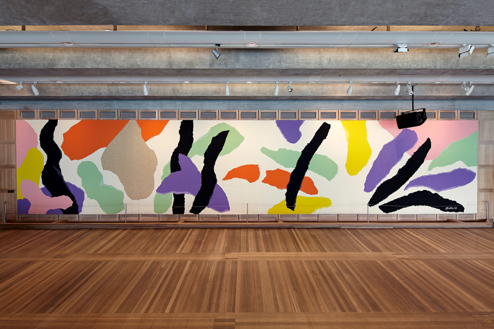
With its iconic sails and incredible performances, the Sydney Opera House has long been one of the world’s most loved buildings. But it had its problems. While more people were visiting than ever before, most simply snapped a selfie outside. They weren’t actually coming in. We needed to find the Sydney Opera House’s voice, and let people know that although things look great from the harbour, the real magic happens inside.
Solution
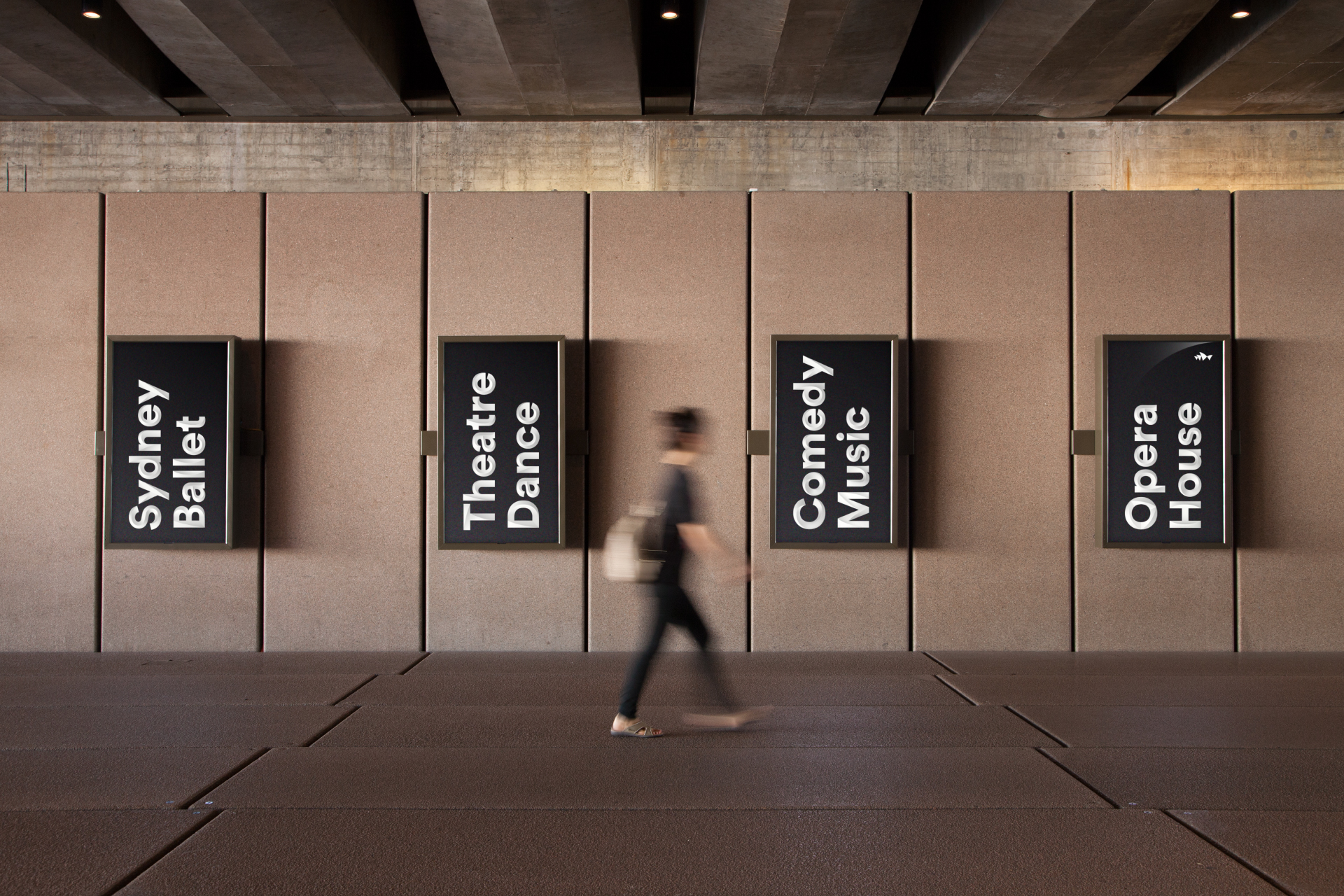
We created Shifting Perspectives – a brand idea that inspires conversation around culture and art, and helps visitors understand there’s more to the Sydney Opera House than opera.
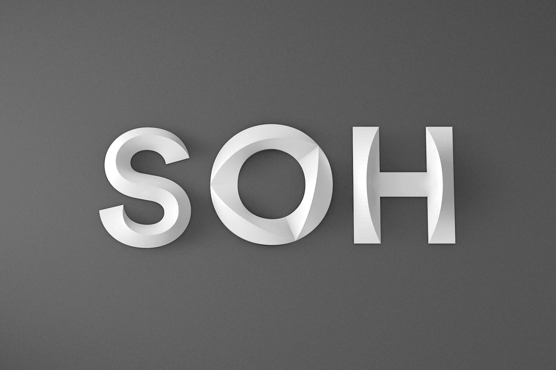
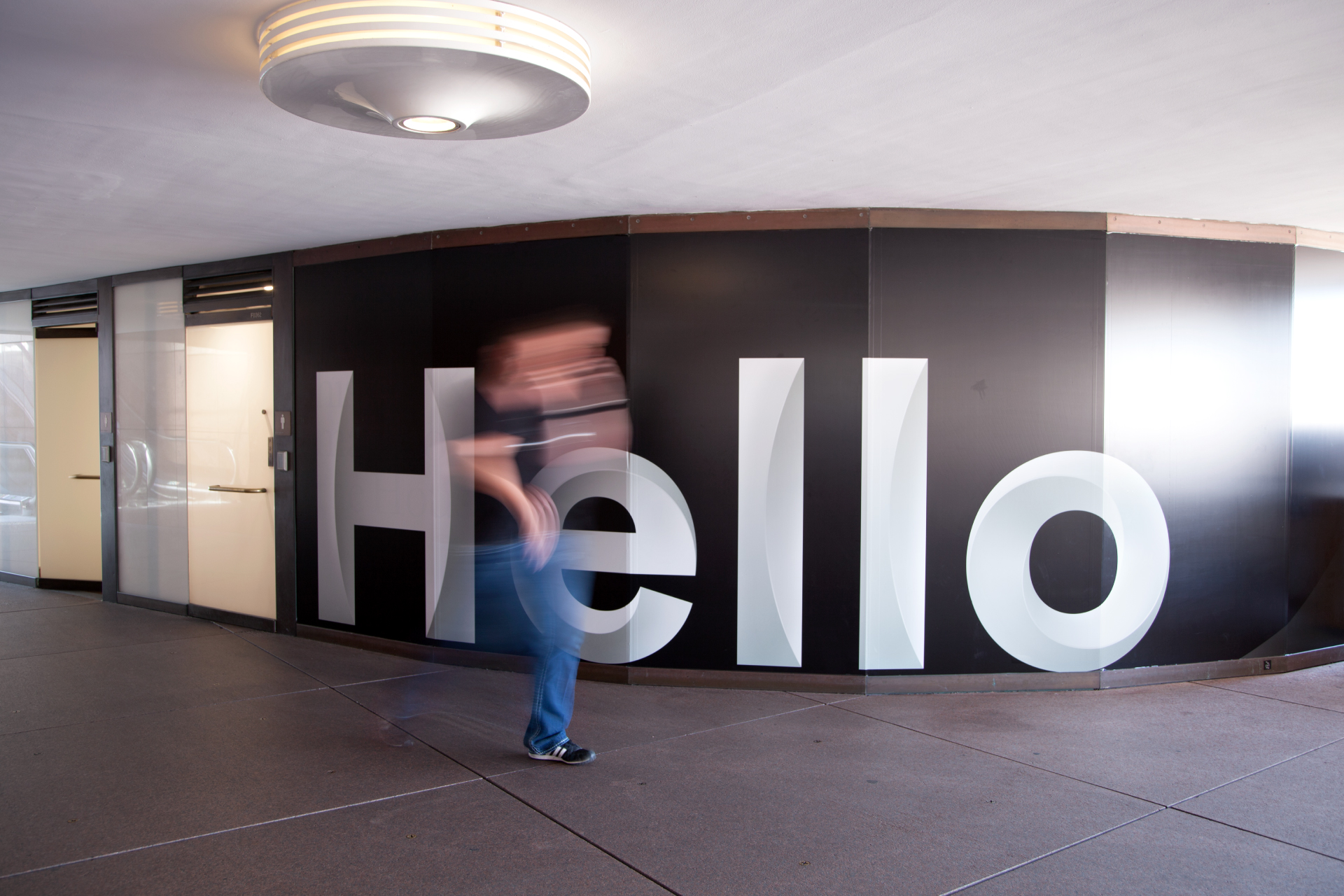
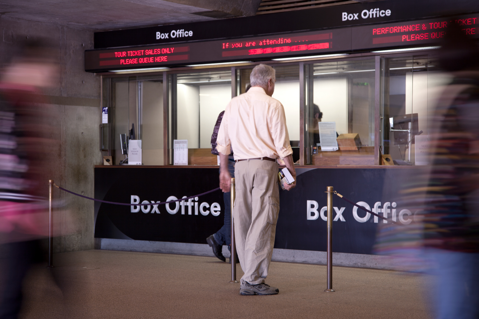
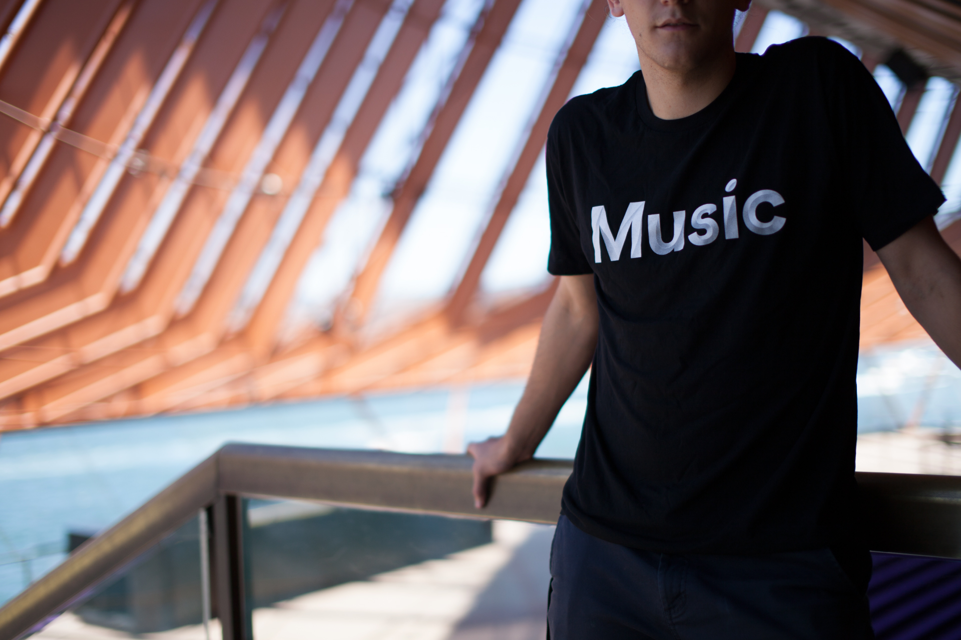
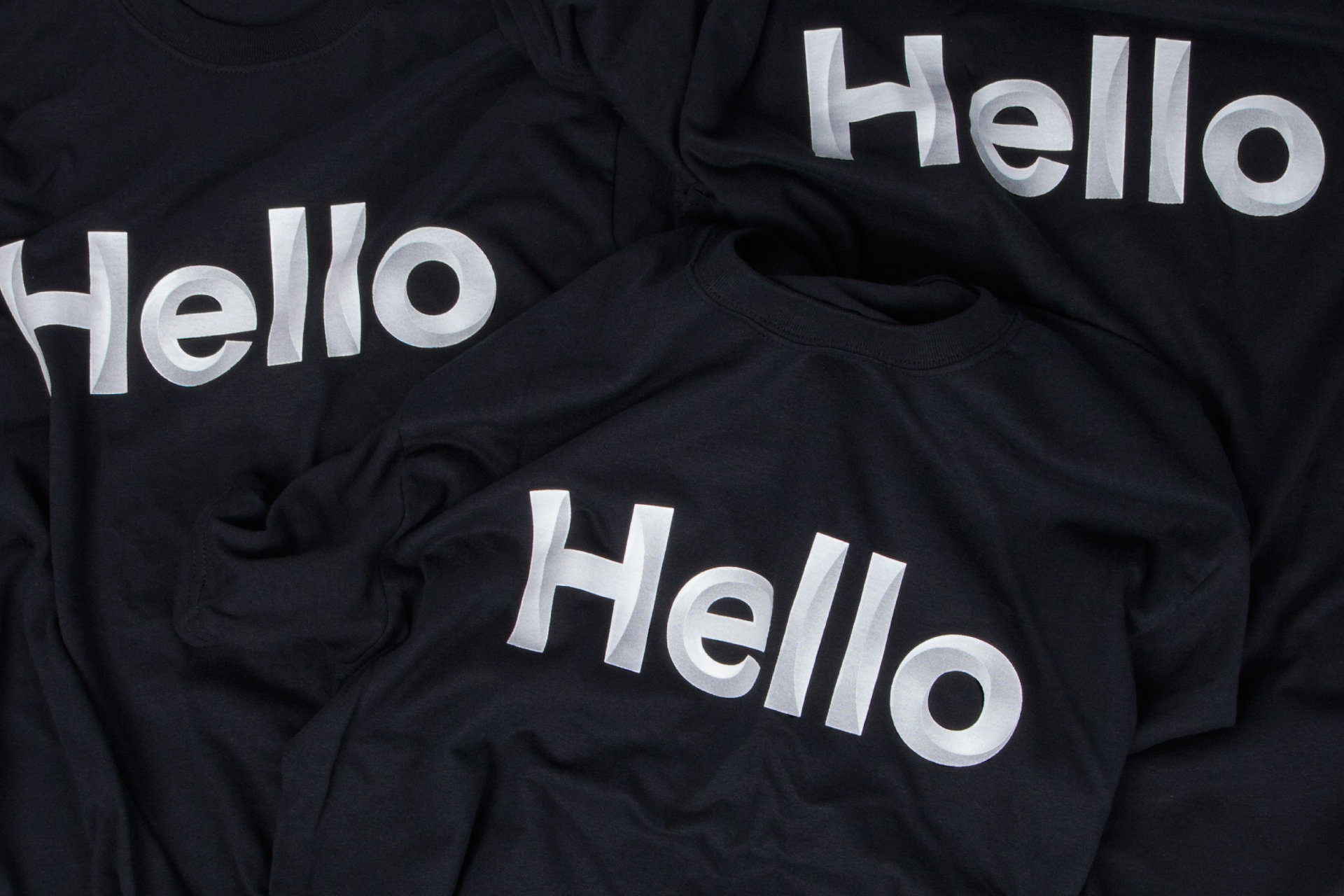
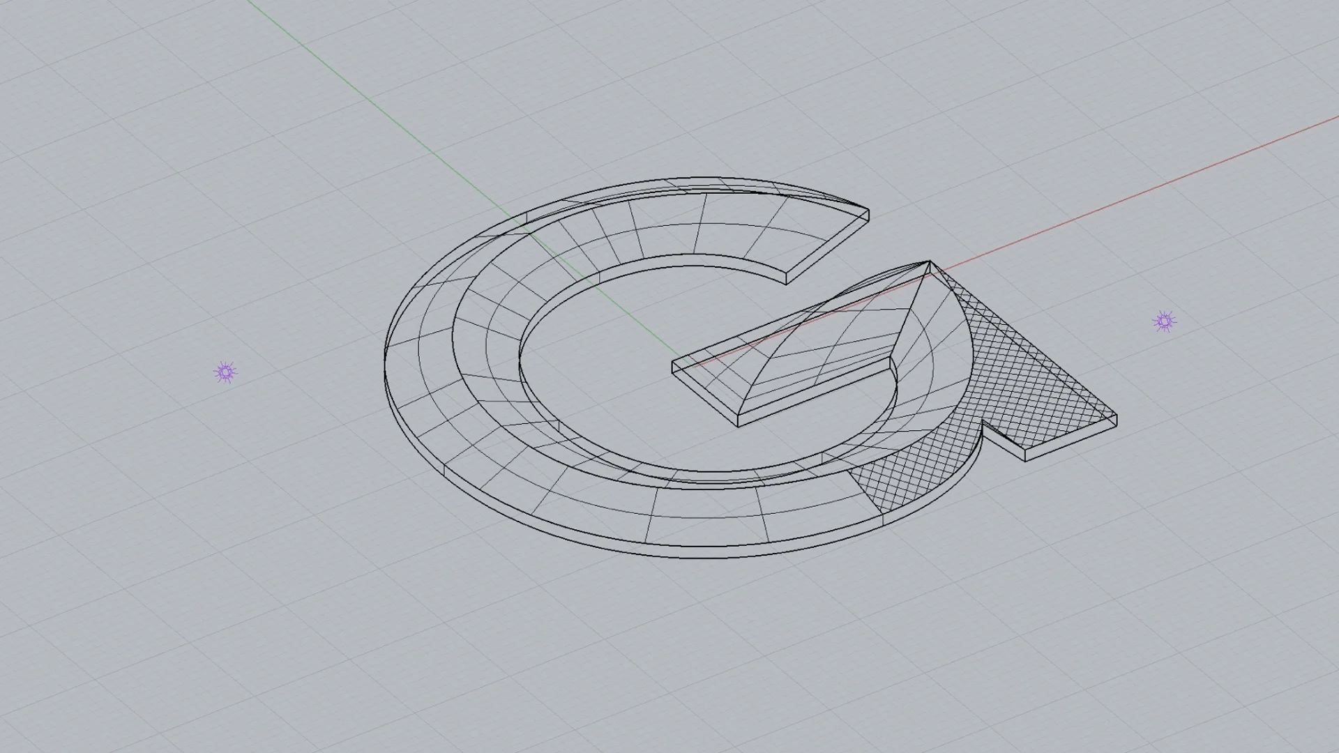
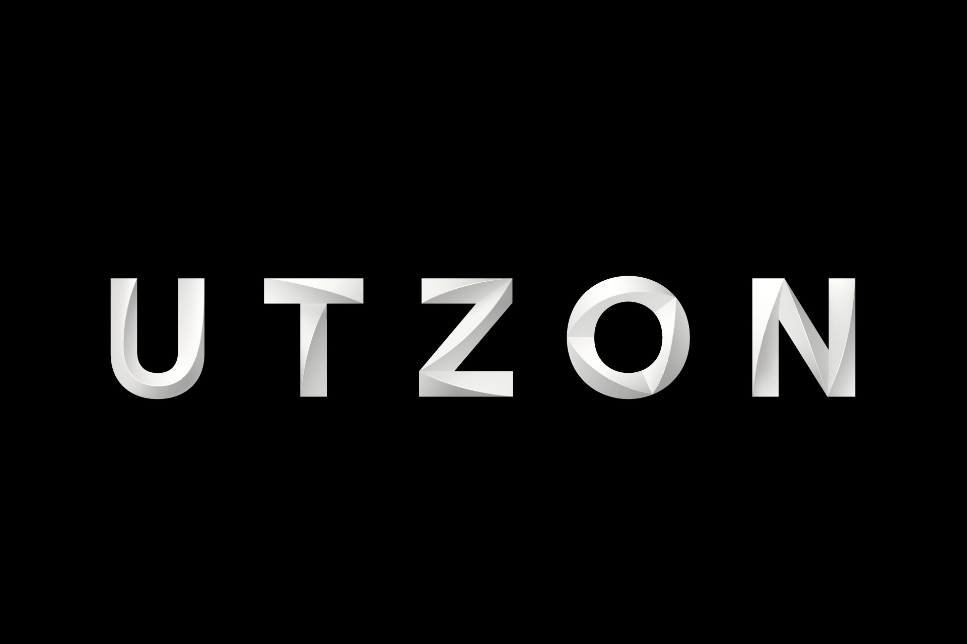
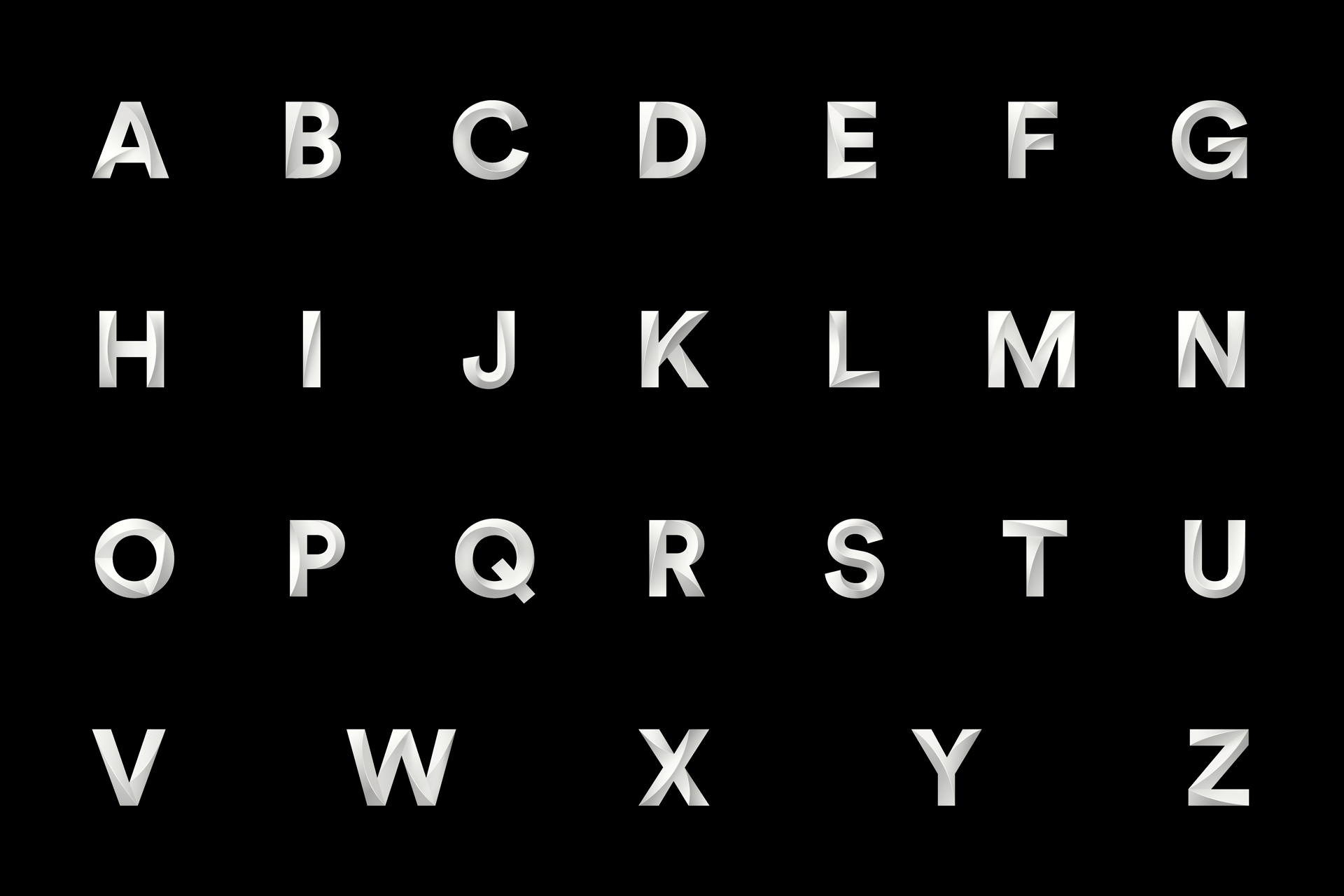
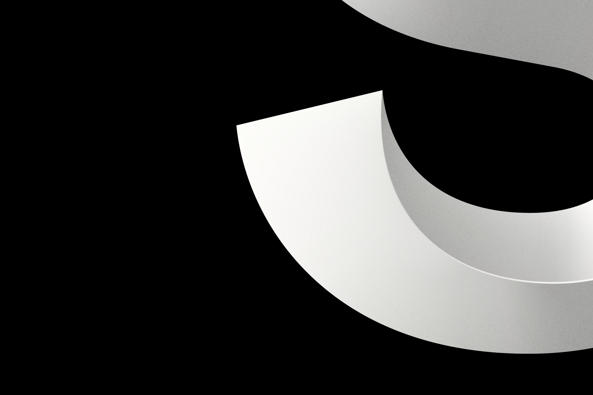
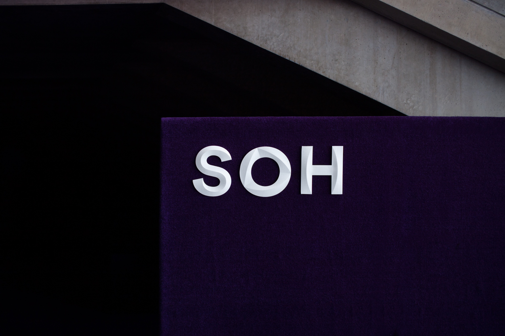
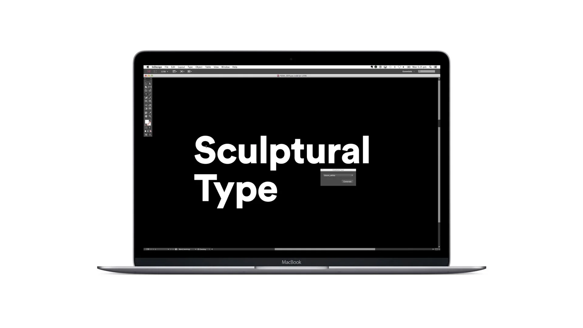
Paired with Shifting Perspectives is a sculptural form language. Sails are used to draw attention and interact with photography, while the 3D Utzon typeface reflects the contours of the building itself. Together, they complement the content of any show poster or message, before bringing the focus back to the master brand.
Studio: Interbrand / Typography: Laurenz Brunner / Motion: Collider
